Hi everyone,
I’ve been playing with Photoshop trying to get a headstart on the front cover design for The Ardenna Crossing. I downloaded some new fonts to try out for the lettering and I thought I’d share some of the ideas. Any feedback is appreciated. Not long now, people!
Cheers,
Richard
1

2
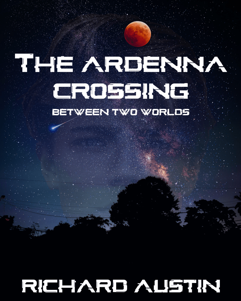


I like 2 and 5 and 6 actually 🤣
LikeLike
Yes, the adults seem to like 2. The kids at school I showed liked 1
LikeLike
I don’t know about 6. I liked t idea of the red word but it makes it seem more like ‘crime thriller’ than sci-fi. The kids at school seemed to like the font on 1 and 5 but I’m not sure – it seems a bit dated.
LikeLike